30 March 2017

More problematic articles from the Food and Brand Lab

If you've been following my posts, and those of my co-authors, on the problems with the research from the Cornell Food and Brand Lab, there probably won't be very much new here.  This post is mainly intended to collect a few problems in other articles that haven't been published yet, and which don't show any particularly new problem.

If you're trying to keep track of all of the problems, I recommend Tim van der Zee's excellent blog post entitled "The Wansink Dossier: An Overview", which he is updating from time to time to included new discoveries (including, hopefully, the ones below).

Apparent duplication of text without appropriate attribution


Wansink, B., & van Ittersum, K. (2007). Portion size me: Downsizing our consumption norms. Journal of the American Dietetic Association, 107, 11031106. http://dx.doi.org/10.1016/j.jada.2007.05.019

Wansink, B. (2010).  From mindless eating to mindlessly eating better. Physiology & Behavior, 100,  454–463. http://dx.doi.org/10.1016/j.physbeh.2010.05.003

Wansink, B., & van Ittersum, K. (2013). Portion size me: Plate-size induced consumption norms and win-win solutions for reducing food intake and waste.  Journal of Experimental Psychology: Applied, 19, 320–332. http://dx.doi.org/10.1037/a0035053

The 2010 article contains about 500 words (in the sections entitled "1.1. Consumption norms are determined by our environment", p. 455, and "1.2. Consumption monitoring — do people really know when they are full?", p. 456) that have been copied verbatim (with only very minor differences) from the sections entitled "Portion Sizes Create Our Consumption Norms" (p. 1104) and "We Underestimate the Calories in Large Portions" (pp. 1104–1105) in the 2007 article.

The 2013 article contains about 300 words (in the section entitled "Consumption Norms", p. 321) that have been copied verbatim (with only very minor differences) from the section entitled "Portion Sizes Create Our Consumption Norms" (p. 1104) in the 2007 article.  An indication that this text has been merely copied and pasted can be found in the text "For instance, larger kitchenware in homes all [sic] suggest a consumption norm...", which appears in the 2013 article; in the 2007 article, "larger kitchenware" was one of three items in a list, so that the word "all" was not inappropriate in that case.  (Remarkably, the 2013 article has a reference to the 2007 article in the middle of the text that was copied, without attribution, from that earlier article.)

The annotated versions of these articles, showing the apparently duplicated text, can be found here.

Unusual distributions of terminal digits in data


Wansink, B. (2003).  Profiling nutritional gatekeepers: Three methods for differentiating influential cooks.  Food Quality and Preference, 14, 289–297. http://dx.doi.org/10.1016/S0950-3293(02)00088-5

This is one of several studies from the Food and Brand Lab where questionnaires were sent out to different-sized samples of people chosen from different populations, and exactly 770 replies were received in each case, as I mentioned last week here.

I aggregated the reported means and F statistics from Tables 1 through 4 of this article, giving a total of 415 numbers reported to two decimal places.  Here is the distribution of the last digits of these numbers:


I think it is reasonable to assume that these final digits ought, in principle, to be uniformly distributed. Following Mosimann, Dahlberg, Davidian, and Krueger (2002), we can calculate the chi-square goodness-of-fit statistic for the counts of each of the 10 different final digits across the four tables:

> chisq.test(c(28, 41, 54, 59, 39, 48, 38, 26, 40, 42))
X-squared = 22.855, df = 9, p-value = 0.006529

It appears that we can reject the null hypothesis that the last digits of these numbers resulted from random processes.

Another surprising finding in this article is that in Table 4, the personality traits "Curious" and "Imaginative" load identically on eight of the ten different categories of cook that are described.  The factor loadings for these traits are described in two consecutive lines of the table.  It's not clear if this is a copy/paste error, a "retyping from paper" error, or if these numbers are actually correct (which seems like quite a coincidence).


This article, annotated with the above near-duplicate line highlighted, can be found here.

Test statistics inconsistent with reported means and standard deviations


Wansink, B., Cardello, A., & North, J. (2005). Fluid consumption and the potential role of canteen shape in minimizing dehydration. Military Medicine, 170, 871–873. http://dx.doi.org/10.7205/MILMED.170.10.871

All of the reported test statistics in Table 1 are inconsistent with the means and standard deviations to which they are meant to correspond:

Actual ounces poured: reported F=21.2; possible range 24.39 to 24.65
Estimated ounces poured: reported F=2.3; possible range 2.57 to 2.63
Actual ounces consumed: reported F=16.1; possible range 17.77 to 17.97

Additionally, the degrees of freedom for these F tests (and others in the article) are consistently misreported as (1,49) instead of (1,48).

On p. 873, the following is reported: "A second study involving 37 military police cadets in basic
training at Fort Leonard Wood, Missouri, indicated that there was a similar tendency to pour more water into a short, wide opaque canteen than into a tall, narrow prototype canteen bottle (11.6 vs. 10.2 ounces; F(1,35) = 4.02; p < 0.05)".  Here, the degrees of freedom appear to be correctly reported (assuming that each participant used only one type of canteen), but the correct p value for F(1,35) is .053.  (This is one of the very rare problems in the Food and Brand Lab's output that statcheck might have been expected to detect.  However, it seems that the "=" sign in the reported statistic is a graphic, not an ASCII = character, and so statcheck can't read it.)

An annotated version of this article, showing the apparently erroneous statistics and some other notes that I made as I read the article, can be found here.

22 March 2017

Strange patterns in some results from the Food and Brand Lab

Regular readers of this blog, and indeed the news media, will be aware that there has recently been some scrutiny of the work of Dr. Brian Wansink, Director of the Cornell Food and Brand Lab. We have seen what appear to be impossible means and test statistics; inconsistent descriptions of the same research across articles; and recycling of text (and even, it would appear, a table of results) from one article or book chapter to another. (Actually, Dr. Wansink has since claimed that this table of results was not recycled; apparently, the study was rerun with a completely different set of participants, and yet almost all of the measured results—17 out of 18—were identical, including the decimal places.  This seems quite remarkable.)

In this post I'm going to explore some mysterious patterns in the data of three more articles that were published when Dr. Wansink was still at the University of Illinois at Urbana-Champaign (UIUC).  These articles appear to form a family because they all discuss consumer attitudes towards soy products; Dr. Wansink's CV here [PDF] records that in 2001 he received $3,000 for “Disseminating soy-based research to developing countries”. The articles are:

Wansink, B., & Chan, N. (2001). Relation of soy consumption to nutritional knowledge. Journal of Medicinal Food, 4, 145–150. http://dx.doi.org/10.1089/109662001753165729

Wansink, B., & Cheong, J. (2002). Taste profiles that correlate with soy consumption in
developing countries. Pakistan Journal of Nutrition, 1, 276–278.

Wansink, B., & Westgren, R. (2003). Profiling taste-motivated segments. Appetite, 41, 323–327.
http://dx.doi.org/10.1016/S0195-6663(03)00120-X

For brevity, I'll mostly refer to these articles by the names of their co-authors, as "Chan", "Cheong", and "Westgren", respectively.

Wansink & Chan (2001)


Chan describes a study of people's attitudes towards "medicinal and functional foods such as soy". It's not clear what a "functional food"—or, indeed, a "non-functional food"—might be, and it might come as a surprise to people in many Asian countries who have been consuming soy all their life to hear it described as a "medicinal food", but I guess this article was written from an American perspective. Exactly what is categorised under "soy" is not made clear in the article, but one of the items asked people how many times in the past year they purchased "tofu or soy milk", so I presume we're talking about those kind of soy products that tend to be associated in Western countries with vegetarian or vegan diets, rather than soy sauce or processed foods containing soy lecithin.

Of interest to us here is Table 2 from Chan. This shows the responses of 770 randomly-selected Americans, split by their knowledge of "functional foods" (apparently this knowledge was determined by asking them to define that term, with the response being coded in some unspecified way) to a number of items about their attitudes and purchasing habits with respect to soy products. Here is that table:


The authors' stated aim in this study was to see whether "a basic (even nominal) level of functional foods knowledge is related to soy consumption" (p. 148). To this end, they conducted a one-way ANOVA between the two groups (people with either no or some knowledge of functional foods), with the resulting F statistic being shown in the right-hand column of the table. You can see that with one exception ("Soy has an aftertaste"), all of the F statistics have at least one star by them, indicating that they are significant at the .05 or .01 level. Here is our first error, because as every undergraduate knows, F(1, D) is never significant at the .05 level below a value of 3.84 no matter how large the denominator degrees of freedom D are, thus making three of those stars (for 3.1, 3.6, and 2.9) wrong.

Also wrong are the reported degrees of freedom for the F test, which with the sample sizes at the top of the columns (138 and 269) should be (1, 405). Furthermore, the number of participants who answered the question about their knowledge of functional foods seems to be inconsistently reported: first as 363 on p. 147 of the article, then as 190 in the footnote to Table 1, which also appears to claim that 138 + 269 = 580. (It's also slightly surprising that out of 770 participants, either 363 or 190 didn't give a simple one-line answer to the question about their knowledge of functional foods; the word "none" would apparently have sufficed for them to be included.)

However, if you have been following this story for the past couple of months, you will know that these kinds of rather sloppy errors are completely normal in articles from this lab, and you might have guessed that I wouldn't be writing yet another post about such "minor" problems unless there was quite a lot more to come.

It would be nice to be able to check the F statistics in the above table, but that requires knowledge of the standard deviations (SDs) of the means in each case, which are not provided. However, we can work provisionally with the simplifying assumption that the SDs are equal for each mean response to the same item. (If the SDs are unequal, then one will be smaller than the pooled value and the other will be larger, which actually exacerbates the problems reported below.) Using this assumption, we can try a number of candidate pooled SDs in an iterative process and calculate an approximation to the SD for the two groups. That gives these results:


The items on lines 1–3 and 26–28 had open-ended response formats, but those on lines 4–25 were  answered on 9-point Likert scales, from 1="strongly disagree" to 9="strongly agree". This means that the absolute maximum possible SD for the means on these lines is about 4.01 (where 4 is half the  difference between the highest and lowest value, and .01 is a little bonus for the fact that the formula for the sample SD has N−1, rather than N, in the denominator). You would get that maximum SD if half of your participants responded with 1 and half responded with 9. And that is only possible with a mean of 5.0; as the mean approaches 1 or 9, the maximum SD becomes smaller, so that for example with a mean of 7.0 or 3.0 the maximum SD is around 3.5.  (Again, it is possible that one of the SDs is smaller and the other larger. But if we can show that the pooled SD is impossible with either mean, then any split into two different SDs will result in one SD being even higher, making one of the means "even more impossible".)

In the above image, I have highlighted in orange (because red makes the numbers hard to read) those SDs that are impossible, either because they exceed 4.01, or because they exceed the largest possible SD for the corresponding means. In a couple of cases the SD is possible for one of the means (M1), but not the other (M2), and if the SD of M2 were reduced to allow it to be (just) possible, the SD of M1 would become impossible.

I have also highlighted in yellow the SDs that, while not strictly impossible, are highly implausible. For example, the most moderate of these cases ("Soy will fulfill my protein requirements", M=4.8, SD=3.4) requires well over half of the 138 participants in the "no knowledge of functional food" group to have responded with either 1 or 9 to an item that, on average, they had no very strong opinion about (as shown by the mean, which is almost exactly midway between "strongly disagree" and "strongly agree"). The possible distribution of these responses shown below reminds me about the old joke about the statistician with one foot in a bucket of ice and another in a bucket of boiling water, who reports being "very comfortable" on average.


Thus, around half of the results—either the means, or the F statistics, or both—for the 22 items in the middle of Table 2 of Chan cannot be correct, either due to mathematical impossibility or because it would require extreme response patterns that simply don't happen in this kind of survey (and which, if they had occurred by some strange chance, the authors ought to have detected and reported).

A demonstration that several of the results for the open-ended (first and last three) items of the table are also extremely implausible is beyond the scope of this blog post (hint: some people spend a lot of time at the store checking that there is no soy in the food they buy, and some people apparently eat dinner more than once a day), but my colleague James Heathers will probably be along to tell you all about this very soon as part of his exciting new tool/method/mousetrap that he calls SPRITE, which he kindly deployed to make the above image, and the three other similar images that appear later in this post.

One more point on the sample size of 770 in this study.  The article reports that questionnaires were mailed to "a random national sample (obtained from U.S. Census data) of 1,002 adults", and 770 were returned, for a payment of $6.  This number of responses seems to be very common in research from this lab.  For example, in this study 770 questionnaires out of 1,600 were returned by a sample of "North Americans", a term which (cf. the description of the sample in Westgren, below) presumably means US and Canadian residents, who were paid $5. Meanwhile, in this study, 770 questionnaires out of 2,000 mailed to "a representative sample from 50 US states" were returned in exchange for $3.  One might get the impression from those proportions that paying more brings a higher response rate, but in this study when 2,000 questionnaires were mailed to "North Americans", even a $6 payment was not sufficient to change the number of responses from 770.  Finally, it is unclear whether the sample of 770 mentioned in this article and (in almost-identical paragraphs) in this article and this book chapter represents yet another mailing, or if it is the same as one of those just listed, because the references do not lead anywhere; this article gives slightly more details, but again refers back to one of the others.  If any readers can find a published description of this "loyalty program survey of current customers of a Kraft product" then I would be interested to see it. (A couple of people have also mentioned to me that a response rate of 77%, or even half that, is remarkably high for a randomly mailed survey, even with an "honor check" as an incentive.)

Now let's look at the other two articles out of the three that are the main subject of this blog post. As we'll see, it makes sense to read them together.

Wansink & Cheong (2002); Wansink & Westgren (2003)


Cheong (available here [PDF]) reports a study of the attitudes and soy consumption habits of a sample of 132 Indians and Pakistanis who were living in the United States (thus making the article's title, "Taste profiles that correlate with soy consumption in developing countries [emphasis added]", perhaps a little inaccurate) and associated in some way with UIUC. Westgren describes the results of a very similar study, with almost exactly the same items, among 606 randomly-selected North Americans (US and Canadian residents, selected from phone records).

The first thing one notices in reading these two articles is that about 40% of the text of Cheong has been duplicated verbatim in Westgren, making up about 20% of the latter article. We have seen this before with the lead author of these articles, but apparently he considers it not to be a big deal to "re-emphasize" his work in this way. Some of the duplicated text is in the Methods section, which a few people claim is not a particular egregious form of self-plagiarism, but the majority comes from the Results and Discussion sections, which is unusual, to say the least, for two different empirical articles. This image shows the extent of the duplication; Cheong is on the left, Westgren on the right.


The evolution of Cheong into Westgren can be followed by downloading two drafts of the latter article from here (dated May 2003) and here (dated July 2003). The July version is very close to the final published text of Westgren. Interestingly, the Properties field of both of these PDFs reveals that the working title of the manuscript was "Profiling the Soy Fanatic". The co-author on the May draft is listed as JaeHak Cheong, but by July this had been changed to Randall Westgren.

As with Chan, the really interesting element of each of these articles is their respective tables of results, which are presented below, with Cheong first and Westgren second. The first seven items were answered on a 1–9 Likert-type scale; the others are expressed as a number of evening meals per week and so one would normally expect people to reply with a number in the range 0–7.


(For what it's worth, there is another incorrect significance star on the F statistic of 3.6 on the item "In general, I am an adventurous person" here.)

[[ Update 2017-03-23 22:10 UTC: As pointed out by an anonymous commenter, the above statement is incorrect. I hadn't taken into account that the numerator degrees of freedom are 2 here, or that the threshold for a star is p < 0.10, not 0.05.  I apologise for this sloppiness on my part.  However, this means that there are in fact two errors in the above table, because both this 3.6 and 5.9 ("Number of evening meals with which you drink wine during the average week") should have two stars.  It's particularly strange than 5.9 doesn't have two stars, since 5.3 ("I am traditional") does. ]]
 

Just as an aside here: I'm not an expert on the detailed eating habits of Indians and Pakistanis, but as far as I know, soy is not a major component of the traditional diet of citizens of either nation. Pakistanis are mostly Muslims, almost all of whom eat meat, and Indians are mostly Hindus and Sikhs (who tend to consume a lot of dairy if they are vegetarians) or Muslims. So I was quite surprised that out of 132 people from those two countries surveyed in Cheong, 91 claimed to eat soy.  Maybe people from the Indian sub-continent make more radical adaptations to their diet when they join an American academic community than just grabbing the occasional lunch at Subway.

OK, back to the tables.  Once again, it's instructive to examine the F statistics here, as they tell us something about the possible SDs for the samples.


For ease (I hope) of comparison, I have included blank lines for the two items that appeared in Cheong but not in Westgren. It is not clear why these two items were not included, since the May 2003 draft version of Westgren contains results (means and F statistics) for these items that are not the same as those in the published Cheong article, and so presumably represent the results of the second survey (rather than the remnants of the recycling exercise that was apparently involved in the generation of the Westgren manuscript). There are also four means that differ between the May draft of Westgren and the final article: "I live with (or am) a great cook"/"Health-related" (6.1 instead of 5.8), and all three means for "Number of evening meals eaten away from home during the average week" (0.9, 1.2, and 2.0 instead of 0.7, 1.7, and 1.7). However, the F statistics in the draft version for these two items are the same as in the published article.

The colour scheme in the tables above is the same as in the corresponding table for Chan, shown earlier. Again, a lot of the SDs are just impossible, and several others are, to say the least, highly implausible. As an example of the latter, consider the number of evening meals containing a soy-related food per week in the Indian-Pakistani group. If the SD for the first mean of 0.6 is indeed equal to the pooled value of 2.8, then the only possible distribution of integers giving that mean and SD suggests that two of these "non soy-eaters" must be eating soy for dinner eleven and fourteen times per week, respectively:

If instead the SD for this mean is half of that pooled value at 1.4, then a couple of the non-soy eaters must be having soy for dinner four or five times a week. This is one of several possible distributions, but they all look fairly similar:

This "more reasonable" SD of 1.4 for the non-soy eaters would also imply a pooled SD of 3.2 for the other two means, which would mean that about a third of the people who were "unambiguously categorized as eating soy primarily for health reasons" actually reported never eating soy for dinner at all:

To summarise: For five out of 11 items in Cheong, and seven out of nine items in Westgren, the numbers in the tables cannot—either due to mathematical limitations, or simply because of our prior knowledge about how the world works—be correct representations of the responses given by the participants, because the means and F statistics imply standard deviations that either cannot exist, or require crazy distributions.

Similarities between results in Cheong and Westgren


It is also interesting to note also that the items in Cheong that had problems with impossible or highly implausible SDs in their study of 132 Indians and Pakistanis also had similar problems in Westgren with a sample of 606 random North Americans. This might suggest that whatever is causing these problems might not be an entirely random factor.

Two items from Cheong were not repeated in Westgren (in fact, as noted previously, it seems from the May 2003 draft of Westgren that these two items were apparently included in the questionnaire, but the responses were dropped at some point during drafting), but most of the answers to the remaining nine items seem to be quite similar. As an exercise, I took the sets of 27 means corresponding to the items that appear in both tables and treated them as vectors of potentially independent results.  The scatterplot of these two vectors looks like this:

This seems to me like a remarkably straight line.  As noted above, some of the variables have a range of 1–9 and others 0–7, but I don't think that changes very much.

I also calculated the correlation coefficient for these 27 pairs of scores.  I'm not going to give a p value for this because, whatever the sample, there is likely to be some non-zero degree of correlation at a few points in these data anyway due to the nature of certain items (e.g., for "Number of evening meals in which you eat a soy-related food during the average week", we would expect the people who "never eat soy" to have lower values than those who stated that consumed soy for either taste or health reasons, whatever the sample), so it's not quite clear what our null hypothesis ought to be.

> cheong = c(2.8,5.6,7.1,5.6,5.7,4.5,4.9,5.7,7.9,4.9,4.3,5.4,
4.5,7.9,5.8,3.2,5.6,6.8,0.8,1.1,1.9,0.6,0.5,1.2,0.6,3.7,2.7)
> westgren = c(2.3,5.8,7.2,5.3,4.2,3.1,3.8,6.3,7.8,4.1,4.6,5.8,
4.1,8.3,5.9,3.4,5.8,6.7,0.7,1.7,1.7,0.3,0.7,1.2,0.2,3.1,2.4)
> cor(cheong, westgren)
[1] 0.9731398


Even allowing for the likely non-zero within-item correlation across the two samples mentioned in the preceding paragraph, this seems like a very high value.  We already know from earlier analyses that a considerable number of either the means or the F statistics (or both) in these two articles are not correct. If the problem is in the means, then something surprising has happened for these incorrect means to correlate so highly across the two studies. If, however, these means are correct, then as with the brand loyalty articles discussed here (section E), the authors seem to have discovered a remarkably stable effect in two very different populations.

Uneven distribution of last digits


A further lack of randomness can be observed in the last digits of the means and F statistics in the three published tables of results (in the Cheong, Chan, and Westgren articles). Specifically, there is a curious absence of zeroes among these last digits.  Intuitively, we would expect 10% of the means of measured random variables, and the F statistics that result from comparing those means, to end in a zero at the last decimal place (which in most cases in the articles we are examining here is the only decimal place) . A mathematical demonstration that this is indeed a reasonable expectation can be found here.

Here is a plot of the number of times each decimal digit appears in the last position in these tables:


For each table of results, here are the number of zeroes:

Chan: 84 numbers, 3 ending in zero (item 21/F statistic, 22/"Some knowledge", and 28/F statistic).
Cheong: 44 numbers, 1 ending in zero ("Number of evening meals which contain a meat during
the average week"/"Taste").
Westgren: 36 numbers, none ending in zero.

Combining these three counts, we have four zeroes out of a total of 164 numbers. We can compute (using R, or Excel's BINOMDIST function, or the online calculator here) the binomial probability of this number of zeroes (or fewer) occurring by chance, if the last digits of the numbers in question are indeed random (either because they are the last digits of correctly calculated item means or F statistics, or because the errors—which we know, from the above analysis of the SDs, that some of them must represent—are also random).

> pbinom(4, size=164, prob=0.1)
[1] 0.0001754387


Alternatively, as suggested by Mosimann, Dahlberg, Davidian, and Krueger (2002), we can calculate the chi-square statistics for the counts of each of the 10 different final digits in these tables, to see how [im]probable the overall distribution of all of the final digits is:

> chisq.test(c(4,15,14,17,15,11,19,20,26,23))
X-squared = 21.244, df = 9, p-value = 0.01161

Either way, to put this in terms of a statistical hypothesis test in the Fisherian tradition, we would seem to have good reasons to reject the null hypothesis that the last digits of these numbers resulted from random processes.

Summary


Ignoring the "minor" problems that we left behind a couple of thousand words ago, such as the
unwarranted significance stars, the inconsistently-reported sample sizes, and the apparent recycling of substantial amounts of text from one article to another, we have the following:

1. Around half of the F statistics reported in these three articles cannot be correct, given the means that were reported. Either the means are wrong, or the F statistics are wrong, or both.

2. The attitudes towards soy products reported by the participants in the Cheong and Westgren studies are remarkably similar, despite the samples having been drawn from very different populations. This similarity also seems to apply to the items for which the results give impossible test statistics.

3. The distribution of the digits after the decimal point in the numbers representing the means and F statistics does not appear to be consistent with these numbers representing the values of measured random variables (or statistical operations performed on such variables); nor does it appear to be consistent with random transcription errors.

I am trying hard to think of possible explanations for all of this.

All of the relevant files from this article are available here, if the links given earlier don't work
and/or your institution doesn't have a subscription to the relevant journal

20 March 2017

More apparent duplication from the Food and Brand Lab

This is a brief follow-up to my previous post highlighting some apparent cases of duplicate publication from the Food and Brand Lab.  In that post, we saw apparently duplication of pieces of articles within other articles, an article within a book chapter, and a whole book chapter in two books at once.

There was even what looked like duplicate publication of the same results in two different studies (with different samples of participants).  However, the lead author appears to be claiming here that this apparent duplication was nothing of the sort, because what happened was that " a master’s thesis was intentionally expanded upon through a second study which offered more data that affirmed its findings with the same language, more participants and the same results".

Today I found another case of duplicate publication, this time with the same method, number and description of participants, and tables of results.  I wonder if the lead author will again apparently claim that everything happened exactly the same way twice.

The articles in question are:

Wansink, B., Park, S. B., Sonka, S., & Morganosky, M. (2000). How soy labeling influences preference and taste.  International Food and Agribusiness Management Review, 3, 85–94. http://dx.doi.org/10.1016/S1096-7508(00)00031-8

Wansink, B., & Park, S.-B. (2002). Sensory suggestiveness and labeling: Do soy labels bias taste? Journal of Sensory Studies 17, 483–491.  http://dx.doi.org/10.1111/j.1745-459X.2002.tb00360.x

Here is the (by now traditional) "Christmas tree" illustration of the similarities, with the 2000 article on the left and the 2002 article on the right.  About 1,200 of the 2,200 words in the 2002 article have been copied more or less verbatim from the earlier article.


The samples appear to be identical:
Of the 155 subjects who participated in the experiment, 45% were homemakers from the Midwest (average age of 31.2; 74.3% female) who received $6 donation for their participation, and 55% were undergraduate students (average age of 20.3; 52.4% female) from 11 different states and 8 different countries who received course credits for their participation. (Wansink et al., 2000, p. 87)
Of 155 participants who participated in the experiment 45% were meal-planners and local adults in the central Illinois area (ages 22 to 45) who received $6 donation for their participation, and 55% were undergraduate students at the University of Illinois (ages 17 to 21) who received course credit in exchange for their participation. (Wansink et al., 2002, p. 485)
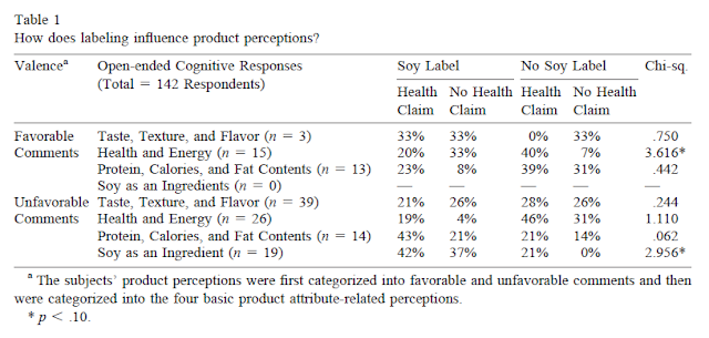
The tables of results are basically identical, at least to the extent that they occur in both articles.  Table 1 of both articles is the same except for the order of the items and the number of reported decimal places of the test statistics.  Tables 2a and 2b of the 2000 article correspond to the Tables 2 and 3 of the 2002 article, except that each of those tables only has six items in the latter version instead of 10 in the original.  Table 3 of the 2000 article is not re-used in the 2002 article.  Interested readers can look this up in detail in the articles, but for illustration here is Table 1 from each article (2000 first):


Intriguingly, the 2002 article contains this sentence in the acknowledgements: "Thanks also to Steven T. Sonka and Michelle Morganosky for assistance on the original version of this project" (p. 483).  Sonka and Morganosky were the two authors on the first article who were not listed as authors on the second.  Presumably any words they wrote did not make it through the copy-paste operation that seems to have been used to prepare the 2002 article.

It seems that International Food and Agribusiness Management Review closed down in 2002, but the Journal of Sensory Studies is still going; indeed, this lab published one of the now-infamous "pizza papers" there in 2014.

As usual, all of the relevant files for this post are available here.

18 March 2017

Should researchers make money from books?

I missed this tweet when it appeared yesterday. By the time someone pointed me to the rather animated thread that followed, it had gone quiet again. (Daniël put out an earlier tweet on the same subject here, but the follow-up thread was a lot shorter.)
I think it's fair to say that Daniël didn't get a lot of takers for his idea. (I'll let you read the thread/s yourself, as I find that one embedded tweet in a blog post is already annoying enough, especially when reading on a mobile device.) There were discussions about the remuneration system for US academics whereby many of them don't get a salary for three months in the summer (this seems utterly weird to Europeans, but our American colleagues just treat it as part of the landscape), as well as questions about intellectual property.

At one point Daniël revealed that if you want him to come to your university or conference and give some version of his excellent MOOC on statistical inferences (I took it, I passed, I am now quite a bit less ill-informed on several statistical topics) then he will charge you $1,000.  But I think that he would argue—and I certainly wouldn't object—that being compensated for your time to show up somewhere in person is not unreasonable.  (I asked Daniël to comment on this post before I published it.  He pointed out that he does plenty of other teaching for free.  He also adds that the best way to follow his course is to take it online, because there are no "ums" and "erms", and you can schedule your own bathroom breaks.)

Daniël's argument, if I've understood it correctly, is based on the following points:
1. The general principle that knowledge should be freely available.
2. The acknowledgement that in many (most?) cases, the money that paid for either (a) the specific empirical research that led to the findings being discussed in the book, or (b) the basic academic job of the person writing the book, came from taxpayers. I don't think I've ever discussed "Politics with a capital P" with Daniël, not least because he and I don't get to vote in the same country, but I hope he will tolerate me guessing that he is probably somewhere to the left of centre. I find it particularly commendable that he frequently communicates in public the awareness that the money that pays his salary does not fall from the skies every time it rains in Rotterdam(*).
3. A belief that what you have learned, what you have discovered, what you "know", doesn't "belong to you" (cf. point 1).

A quick pause for full disclosure (and a shameless plug) here: I am one of the editors of this forthcoming book (**), for which I will get a royalty of about $7 for every copy sold. Actually, this needn't be a pause --- it can be an interesting case study of Daniël's logic. Some of the knowledge that went into my contribution to that book (which, apart from being the principal assembler and coordinator of the overall manuscript, was as a chapter author and a critical reviewer of many of the chapters) was acquired while I was a *paying* Master's student (my MSc cost me about $12,000 in fees, plus probably another $8,000 in travel and lodging expenses). A little has been acquired in my more recent role as a non-paying, but non-salaried PhD student. Most was just from reading, interacting with people, and some attempts at critical thinking. My situation in science is obviously quite atypical, but any system that attempts to determine what is either legally or morally acceptable has to be able to define and cope with edge cases. On the other hand, my co-editors are (as far as I know) full-time salaried academics. Should different rules apply to the various editors of the same book? Who is going to make and enforce these rules?

Back to Daniël's points: I sort of agree and sort of don't. (People who have read some of my, er, "output" are sometimes surprised to find how ambivalent I am on many issues.) Writing a book is hard work --- it's almost certainly a qualitatively different experience from writing a journal article. (I haven't written a book from scratch. But I know how hard it is to coordinate a big manuscript, and I did translate a full-length book [PDF] --- one which, incidentally, had previously been scanned and put online so that the author couldn't expect to receive much in the way of royalties from its sale afterwards. Also, many books by academics combine accounts of their own (or others') research with their interpretations of what these might mean for society. Some of Roy Baumeister's (sometimes provocative ***) books are a good example of this, I think.

On the other hand, I think that people who defend the idea of deriving income from books need to check that their logic on this point follows their logic when it comes to the publishing of scientific articles. Most of the people who responded to Daniël's tweets (at least, among the names I recognised) are people who strongly defend open access publishing. But it's very easy to denounce the evils of publishing companies when you don't get any revenue yourself from their output. Among the subset of pro-open access people who have also written books, I don't see many of them exhorting people to place PDF copies of those books on Sci-Hub. (Anyone want to bet that we will not hear at some point of a scandal whereby some researcher or other has been taking kickbacks from the article processing charges --- which are typically paid for out of grant money --- at open access journals? I hasten to add that I have no evidence that this is taking place at the moment, but I would be amazed if it didn't happen. People can be very... creative when it comes to spending other people's money.)

One area where I feel less ambivalent is in the writing of "popular" books. If you leverage your government-funded research and/or status as a professor at a publicly-funded university into pop science or self-help books, seminars, and pay-to-listen podcasts, not to mention sponsored keynotes, corporate consulting gigs, and public speaking appearances, then I think that you ought to be making more of a contribution back than just income tax on the royalties and fees, especially since most of the work that got you that speaking gig was probably done by someone else, who may not even believe in the research any more. (I would have included TED talks in this list, but apparently TED speakers don't get paid. I'm sure they all give those talks out of the goodness of their hearts, and not in any way out of a consideration for how they might leverage their appearance into other, more lucrative speaking opportunities.) Naturally, as per the discussion a couple of paragraphs earlier, I don't have a proposed practical solution for this.

In summary, I find this an interesting debate. Perhaps it's destined to remain theoretical for the foreseeable future (apart from anything else, academic norms tend to span the boundaries of legal jurisdictions), but I think it's worth discussing and I'm glad Daniël raised it.


(*) It would be nice if money did arrive that way, because I lived there for four years and it rains a lot, often horizontally.
(**) Yes, that's a great picture on the cover. It's by my brother-in-law, and I believe that he will get a fee for it. Is this nepotism? I just wanted a non-boring cover design (check out what most handbook cover art is like) and I knew that Tony was pretty handy with a brush; this is a picture that he had painted a while ago. Should we have had a call for tenders to avoid possible questions about nepotism? Hmmm.
(***) I linked to Amazon here, but if you don't believe that academics should benefit from writing books about their own or other people's research, you can find a full PDF of the book without too much trouble. ;-)

16 March 2017

Cornell salutes America's teenage female combat heroes of WW2

A lot has been written about the four "pizza papers" mentioned by Dr. Brian Wansink in his blog post of 21 November 2016.  But so far, it seems nobody has paid much attention to the fifth article co-authored by "the Turkish grad student" mentioned in that blog.  That's a shame, because it appears to reveal a remarkable bit of American military history.

Here's the article:

Sığırcı, Ö, Rockmore, M., & Wansink, B. (2016). How traumatic violence permanently changes shopping behavior.  Frontiers in Psychology, 7, 1298. http://dx.doi.org/10.3389/fpsyg.2016.01298

Because Frontiers in Psychology is an open access journal, you can read this article here.  However, you might want to look at the annotated copy that I've made available here, where you will also find a couple of other relevant files.

When I first read Sığırcı et al.'s article, I didn't pay it too much attention, partly because Tim van der Zee, Jordan Anaya, and I were busy enough with the pizza papers, and partly because its conclusions seemed plausible, even obvious: Long-retired military veterans who experienced heavy or frequent combat are more cautious, conservative consumers than those who only experienced lighter or infrequent combat.  After all, there's an old military saying: "There are old soldiers, and bold soldiers, but there are no old, bold soldiers".  Maybe a degree of caution helps you survive in war, and also carries over into whatever makes you a careful consumer.  However, after a few weeks of exploring the rest of the output of the Cornell Food and Brand Lab, I decided to revisit this article and see what else I could learn from it.

The usual Cornell comedy stuff


Let's start with the self-plagiarism.  It's actually quite mild, compared to what we've seen; about 350 words of the 500-word method section are copied (absolutely verbatim this time, including the typos; no tweaking of occasional words, as we saw in other cases) from this article:

Wansink, B., Payne, C. R., & van Ittersum, K. (2008).  Profiling the heroic leader: Empirical lessons from combat-decorated veterans of World War II.  The Leadership Quarterly, 19, 547–555.  http://dx.doi.org/10.1016/j.leaqua.2008.07.010

I will spare you the usual yellow-highlighted image here, but you can see the duplicated text in the annotated versions of the files here.

Some other things that regular readers of this blog and Jordan's will be expecting are GRIM inconsistencies (i.e., means or percentages that don't match the sample sizes)  and F statistics that are not consistent with the reported means and standard deviations.  And these readers will not be disappointed.  There are 26 GRIM inconsistencies in Table 1, and seven out of the eight F statistics in Table 2 are inconsistent, as is one in Table 3.  (Actually, this is a little unfair.  The inconsistent F in Table 3 is probably the result of both of the standard deviations on the same line in the table being wrong.)  All of these problems are visible in the annotated copy of the article here.

So we could have included this article in with the four pizza papers; it would have fit right in with the quality of those (and other articles from the same lab going back ten or more years).  But just to blog about it now on that basis would be like publishing a news story saying that the President of the United States was rude and badly informed during a press conference: headline news in 2016, not so much in 2017.  The real fun starts when we look closer at the most basic numbers in the study (indeed, in any study), namely the demographics of the sample.

The unique selling points


Let's start with the ages.  This survey was done in the year 2000.  We don't know exactly when, but let's assume it was January (as we'll see, the results would have been even more extreme if participants had reported their ages in December).  These are veterans of combat operations in World War 2, which ended on September 2, 1945.  Assuming that these veterans were not underage volunteers who lied about their age to join the military, their minimum age on that date must have been about 18 years and 2 months, allowing time for basic training and shipping out to the Pacific theatre of operations.  So the youngest of these veterans would have been born in July 1927 and been 72 years of age in January 2000.

Now look at the standard deviations (SD) for the ages.  They are quite high, especially when there is not much room on the low side of the mean.  In fact, those SDs constrain the pattern of ages quite severely.  James Heathers kindly used his new tool, SPRITE, to build a series of possible distributions of ages matching this constraint (plus a supplementary one that none of the respondents should be older than 105 at the time of the survey, because otherwise it proposes a whole bunch of people aged over 120).  Here's what a typical such distribution looks like:
 
What this means is that, if those means and SDs are correct, 200 of the 235 respondents were between 18 and 18.5 years of age at the end of WW2, having presumably experienced repeated heavy combat only in the last few months of the war.  There were one or two slightly older soldiers, and then a bunch who were 50 at the time (and so were 105 years old in 2000).  Almost none of the soldiers can have been aged 19, or 20, or 21, if these numbers are correct.  That is, if the sample is at all representative of actual US combat veterans from WW2, almost nobody who joined at 21 in 1941, or 18 in 1943, survived until 2000 (whether they were exposed to heavy or light combat).

Even more interesting, however, is just how many of these young men, who fought their way to glory at Anzio, Omaha Beach, and Iwo Jima, must have been... women.  Have a look two lines further down in the demographic data:


Among these veterans, 79.3% who saw heavy combat and 80.3% who saw light combat identified in 2000 as men.  Now I'm going to go out on a limb here for a moment and guess that only a very small proportion of these men came out as transgender since 1945.  With that assumption, the implication here is that 20% of these veterans of heavy combat are, and were at the time, women. (*)

This has to be the historical scoop of the last 70 years.  The role of American women outside the US in World War 2 has up to now been believed to be mostly limited to nursing, well away from the front line.  Woman only officially obtained the right to serve in combat roles in the US Army in March 2016.  Yet here we have evidence to suggest that many women took part in combat of all kinds in World War 2—making up about a fifth of all soldiers who were involved in combat operations.  How come we've never seen this in all those war movies?  Can it just be due to sexism on the part of Hollywood producers?  Why can't the true story of the hundreds of thousands of 18-year-old women whose courageous combat liberated the world from the menace of the Axis powers be told?

[scratching sound of needle being pulled from vinyl record]


OK, fun's over.  Let's be serious for a moment.

First, just to be clear, nothing in the two preceding paragraphs is intended to take a dig at women or trans people.

My purpose in this post has been to show that some of the absurdities in this article (and many, many more, whether from this lab or not) are visible to almost anyone who cares to read it.  You don't need to know a thing about statistics to see that the implication that "20% of the US soldiers who saw combat in World War 2 were women" is absurd.  You don't need to know much more about what distributions look like to see that a mean of 75 and an SD of 9 with a floor of 72 is going to lead to a huge right skew. And you can probably guess that, if a piece of work (whether a scientific article or a restaurant meal or a car) has problems like that visible from the moment you look at it, it may well have a bunch of other problems that you only need some simple tools to uncover.

This article appeared in what claims to be a peer-reviewed journal.  The names of the reviewers and action editor are displayed on the article's web page.  I'm trying to work out exactly how closely any of these people looked at the manuscript before approving it for publication, thus elevating it to the status of "science" so that people can write press releases.  We seriously need to improve the way we go about reviewing.  As it is, though, with some publishers, it seems that things may even be getting worse.


(*) Someone suggested that maybe there was a small percentage of women in the original combat roles, and that they became proportionately more numerous from 1945 to 2000 through having higher survival rates.  I find this fairly unlikely, but since we are arguably conditioning on a collider here, I thought I'd mention it for completeness.


02 March 2017

Some instances of apparent duplicate publication from the Cornell Food and Brand Lab

Some concerns have been expressed recently (e.g., here) about a few of the research articles coming from the Cornell Food and Brand Lab.  While reading some past work from the same lab, I noticed some phrases that seemed to recur.  On doing some further comparisons, I found several examples of apparent duplicate publication.  I list five such examples here.

A: Two hundred words for almost any situation


Here are a couple of paragraphs from the same author that have been published at least five times over a 15-year period, with just a few very minor changes of wording each time. I have copied and pasted the relevant text here so that you can see all of the different versions.  (I hope the various publishers will allow this as "fair use".)

1. Wansink, B., & Ray, M. L. (1997).  Developing copy tests that estimate brand usage.  In W. Wells (Ed.), Measuring advertising effectiveness (pp. 359370). Cambridge, MA: Lexington Books.

From page 361:
These two different measures of usage intent have different relative strengths. With infrequent users of a brand, volume estimates will be skewed toward 0 units (especially over a relatively short period of time). This is partially a drawback of numerical estimates that provide no gradation between 0 and 1 unit. In such cases, volume estimates would provide less variance and less information than an estimate of usage likelihood. As a result, usage likelihood estimates would allow a greater gradation in response and would be more sensitive in detecting any potentially different effects these ads might have on usage.

In contrast, with frequent or heavy users of a brand, a volume estimate is likely to be more accurate than a likelihood estimate. This is because the distribution of these volume estimates is more likely to be normally distributed (Pearl 1981). As a result, a volume estimate of one’s usage intent is likely to provide more variance and more information about the intended usage of heavy users than is a likelihood measure, which would undoubtedly be at or near 1.0 (100 percent probable). Under these circumstances, volume estimates would be a more accurate estimate of a heavy user’s usage volume of a brand.
2. Wansink, B., & Sudman, S. (2002).  Predicting the future of consumer panels.  Journal of Database Marketing, 9, 301311. http://dx.doi.org/10.1057/palgrave.jdm.3240078

From page 309:
[T]hese two different measures of usage intent have different relative strengths. With infrequent users of a brand, volume estimates will be skewed toward 0 units (especially over a relatively short period of time). This is partially a drawback of numerical estimates that provide no gradation between 0 and 1 unit. In such cases, volume estimates would provide less variance and less information than an estimate of usage likelihood. As a result, usage likelihood estimates would allow a greater gradation in response and would be more sensitive in detecting any potentially different effects these adverts might have on usage.

In contrast, with frequent or heavy users of a brand, a volume estimate is likely to be more accurate than a likelihood estimate. This is because the distribution of these volume estimates is more likely to be normally distributed. As a result, a volume estimate of a person’s usage intent is likely to provide more variance and more information about the intended usage of heavy users than is a likelihood measure, which would undoubtedly be at or near 1.0 (100 per cent probable). Under these circumstances, volume estimates would be a more accurate estimate of a heavy user’s usage volume of a brand.
3. Wansink, B. (2003).  Response to ‘‘Measuring consumer response to food products’’.
Sensory tests that predict consumer acceptance.  Food Quality and Preference, 14, 23–26. http://dx.doi.org/10.1016/S0950-3293(02)00035-6

From page 25:
These two different measures of usage intent have different relative strengths. With infrequent users of a product, frequency estimates will be skewed toward 0 units (especially over a relatively short period of time). This is partially a drawback of numerical estimates that provide no gradation between 0 and 1 unit. In such cases, the frequency estimates provide less variance and less information than an estimate of consumption likelihood. With light users, consumption likelihood estimates will provide greater gradation in response and more sensitivity in detecting any potentially different effects a particular set of sensory qualities would have on consumption.

In contrast, with frequent or heavy users of a product, a frequency estimate is likely to be more accurate than a likelihood estimate. This is because the distribution of these frequency estimates is more likely to be normally distributed. As a result, a frequency estimate of one’s consumption intent is likely to provide more variance and more information about the intended consumption of heavy users than is a likelihood measure, which would undoubtedly be at or near 1.0 (100% probable). With heavy users, frequency estimates would be a more accurate estimate of a heavy user’s future consumption frequency of a product.
4. Bradburn, N. M., Sudman, S., & Wansink, B. (2004).  Asking questions: The definitive guide to questionnaire designFor market research, political polls, and social and health questionnaires (Revised ed.).  San Francisco, CA: Jossey-Bass.

From pages 134–135:
These two different measures of behavioral intent have different relative strengths. With infrequent behaviors, frequency estimates will be skewed toward 0 (especially over a relatively short period of time). This is partially a drawback of numerical estimates that provide no gradation between 0 and 1 unit. In such cases, frequency estimates would provide less variance and less information than an estimate of likelihood. As a result, likelihood estimates would allow a greater gradation in response and would be more sensitive.

In contrast, with frequent behaviors, a frequency estimate will be more accurate than a likelihood estimate. The reason is that frequency estimates are more likely to be normally distributed. As a result, a frequency estimate is likely to provide more variance and more information than is a likelihood measure, which would undoubtedly be at or near 1.0 (100 percent probable). Under these circumstances, frequency estimates more accurately correspond with actual behavior.
5. Wansink, B. (2012).  Measuring food intake in field studies.  In D. B. Allison and M. L. Baskin (Eds.), Handbook of assessment methods for eating behaviors and weight-related problems: Measures, theories, and research (2nd ed., pp. 327–345). Los Angeles, CA: SAGE.

From page 336:
These two different measures of intake intent have different relative strengths. With infrequent users of a food, frequency estimates will be skewed toward 0 units (especially over a relatively short period of time). This is partially a drawback of numerical estimates that provide no gradation between 0 and 1 unit. In such cases, the frequency estimates provide less variance and less information than an estimate of intake likelihood. With light users, intake likelihood estimates will provide greater gradation in response and more sensitivity in detecting any potentially different effects a particular set of sensory qualities would have on intake.

In contrast, with frequent or heavy users of a food, a frequency estimate is likely to be more accurate than a likelihood estimate. This is because the distribution of these frequency estimates is more likely to be normally distributed. As a result, a frequency estimate of one’s intake intent is likely to provide more variance and more information about the intended intake of heavy users than is a likelihood measure, which would undoubtedly be at or near 1.0 (100 percent probable). With heavy users, frequency estimates would be a more accurate estimate of a heavy user’s future intake frequency of a food.
You can check all of these here.  In addition to the draft PDF versions that I have annotated, the first example (from the 1997 book Measuring Advertising Effectiveness) is also available on Google Books here, the fourth example (from the 2004 book Asking Questions...) is available here, and the fifth example (from the 2012 book  Handbook of Assessment Methods for Eating Behaviors...) is available here.  Note that in the case of Asking Questions..., the PDF is an extract from a copy of the entire book that I found when searching on Google; I hope this possible violation of copyright on my own part will be forgiven.


B: Copying and pasting from multiple articles to make a new one


Consider this review article from 2015:


Wansink, B. (2015). Change their choice! Changing behavior using the CAN approach and activism research. Psychology & Marketing, 32, 486–500. http://dx.doi.org/10.1002/mar.20794

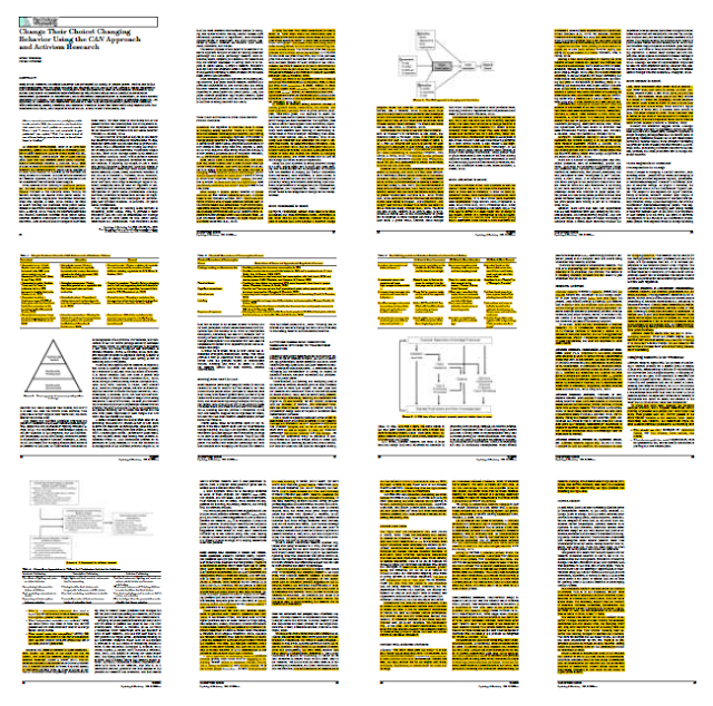
The image below shows the extent to which the 2015 article appears to consist of duplicated text from other publications.  Everything in yellow, plus three of the four figures (which I couldn't work out how to highlight in the PDF) has been published before, some of it twice; I estimate that this represents about 50% of the article.


Specifically, parts of this article appeared to have been copied without attribution from the following works (listed in approximate descending order of quantity of apparently duplicated text):

Wansink, B. (2011). Activism research: Designing transformative lab and field studies.  In D. G. Mick, S. Pettigrew, C. Pechmann, & J. L. Ozanne (Eds.), Transformative consumer research for personal and collective well-being (pp. 66–88). New York, NY: Routledge.

Wansink, B. (2013). Convenient, attractive, and normative: The CAN approach to making children slim by design. Childhood Obesity, 9, 277-278. http://dx.doi.org/10.1089/chi.2013.9405

Wansink, B. (2015). Slim by design: Moving from Can’t to CAN.  In C. Roberto (Ed.), Behavioral economics and public health (pp. 237–264). New York, NY: Oxford University Press.

Wansink, B. (2010). From mindless eating to mindlessly eating better. Physiology & Behavior, 100, 454–463. http://dx.doi.org/10.1016/j.physbeh.2010.05.003

Wansink, B., Just, D. R., Payne, C. R., & Klinger, M. Z. (2012). Attractive names sustain increased vegetable intake in schools. Preventive Medicine, 55, 330–332. http://dx.doi.org/10.1016/j.ypmed.2012.07.012

Annotated versions of all of these documents are can be found here. A Google Books preview of the 2015 chapter "Slim by Design" is available here to compare with the annotated document, which is a final draft version.

C: An article apparently recycled as the basis of a book chapter, without disclosure


The article:

Wansink, B., van Ittersum, K., & Werle, C. (2009).  How negative experiences shape long-term food preferences: Fifty years from the World War II combat front.  Appetite, 52, 750–752.  http://dx.doi.org/10.1016/j.appet.2009.01.001

The book chapter:

Wansink, B., van Ittersum, K., & Werle, C. (2011).  The lingering impact of negative food experiences: Which World War II veterans won’t eat Chinese food?  In V. R. Preedy, R. R. Watson, & C. R. Martin (Eds.), Handbook of behavior, food and nutrition (Vol. 1, pp. 1705-1714). New York, NY: Springer.

It appears that almost all of the 2009 research article—about 1,400 wordshas been duplicated in the 2011 chapter, with only very minor changes and the omission of five sentences, which account for less than 100 words.  No disclosure of this re-use appears in the book chapter.  (In contrast, Chapter 87 in the same book contains, on pages 1357 and 1360, explicit acknowledgements that two passages in that chapter contain material adapted from two other previously published sources; each of these passages corresponds to about 120 words in the original  documents.)

You can examine annotated versions of the article and chapter here (note that the PDF file of the book chapter is an extract from a copy of the entire book that I found on Google).  The book chapter is also available on Google Books here (although three of the ten pages are missing from the preview).

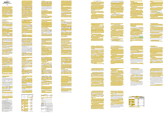
Here is a snapshot of the 2009 article (left) and the 2011 book chapter (right).


D: Two almost-identical book chapters, published more or less simultaneously


There seems to be a very close resemblance between the following two book chapters:

Wansink, B. (2011).  Mindless eating: Environmental contributors to obesity.  In J. Cawley (Ed.), The Oxford handbook of the social science of obesity (pp. 385–414).  New York, NY: Oxford University Press.

Wansink, B. (2012).  Hidden persuaders: Environmental contributors to obesity.  In S. R. Akabas, S. A. Lederman, & B. J. Moore (Eds.), Textbook of obesity: Biological, psychological and cultural influences (pp. 108–122).  Chichester, England: Wiley-Blackwell.

Each chapter is around 7,000 words long.  The paragraph structures are identical.  Most of the sentences are identical, or differ only in trivial details; a typical example is:

(Mindless Eating, p. 388)
While this may appear to describe why many people eat what they are served, it does not explain why they do so or why they may overserve themselves to begin with. Figure 23.1 suggests two reasons that portion size may have a ubiquitous, almost automatic influence on how much we eat: First, portion sizes create our consumption norms; second, we underestimate the calories in large portion sizes.
(Hidden Persuaders, p. 109)
While this may describe why many people eat what they are served, it does not explain why they do so or why they may over-serve themselves to begin with. Figure 6-2 suggests two reasons why portion size may have a ubiquitous, almost automatic influence on how much we eat: First, portion sizes create our consumption norms; second, we underestimate the calories in large portions.
Overall, I estimate that about 85-90% of the text is duplicated, word-for-word, across both chapters.

It seems to be rather unusual to submit the same chapter for publication almost simultaneously to two different books in this way (the books were published less than six months apart, according to their respective pages on Amazon.com).  One occasionally sees a book chapter that is based on an updated version of a previous journal article, but in that case one would expect to find a note making clear that some part of the work had been published before.  I was unable to find any such disclosure in either of these books, whether on the first or last page of the chapters themselves, or in the front matter.  I also contacted the editors of both books, none of whom recalled receiving any indication from the author that any of the text in the chapter was not original and unique to their book.

I found final draft versions of each of these chapters here and here.  Each draft clearly states that it is intended for publication in the respective book in which it finally appeared, which would seem to rule out the possibility that this duplication arose by accident.  Interested readers can compare my annotated versions of these final drafts with each other here.  You can also check these drafts against the published chapters in the Google Books previews here and here (the first has the complete "Mindless Eating" chapter, but four pages of the "Hidden Persuaders" chapter are missing from the second). The degree of similarity is visible in this image, where yellow highlighting indicates text that it identical, word-for-word, between the two drafts ("Mindless Eating" is on the left, "Hidden Persuaders" is on the right).


E: Different studies, same introduction, same summary, different participants, same results


In 2003, when the current director of the Cornell Food and Brand Lab was still at the University of Illinois at Urbana-Champaign [PDF], he published a report of a pair of studies that had a certain number of theoretical aspects in common with another pair of studies that he had previously described in a co-authored article from 2001.  Here are the two references:

Wansink, B., & Seed, S. (2001).  Making brand loyalty programs succeed.  Brand Management, 8, 211–222. http://dx.doi.org/10.1057/palgrave.bm.2540021

Wansink, B. (2003).  Developing a cost-effective brand loyalty program.  Journal of Advertising Research, 43, 301–309. http://dx.doi.org/10.1017/S0021849903030290

I estimate that the introduction and summary sections from the two resulting articles are about 50% identical. You can judge for yourself from this image, in which the 2001 article is on the left, and the 2003 article is on the right.  The introduction is on the first six pages of the 2001 article and the first four pages of the 2003 article.  The summary section is near the end in each case.


Perhaps of greater interest here, though, is a comparison between Table 5 of the 2001 article and Table 2 of the 2003 article, which appear to be almost identical, despite purportedly reporting the results of two completely different studies.

Table 5 in the Wansink and Seed (2001) article apparently represents the results of the second study in that article, in which a questionnaire was administered to "153 members of the Brand Revitalisation Consumer Panel" (p. 216):
As shown in Table 5, this moderate benefit programme captured an average monthly incremental gain of $2.95 from the non-user and $3.10 from the heavy user. For light users, the most cost-effective programme was the one that offered the lowest benefit package. This programme level captured an average monthly incremental gain of $2.00 from the light user. (Wansink & Seed, 2001, p. 218)


Table 2 in the Wansink (2003) article appears to summarise the results of Study 2 of that (i.e., 2003) article, which involved "a nationwide survey of 2,500 adult consumers who had been randomly recruited based on addresses obtained from census records. . . . Of the 2,500 questionnaires, 643 were returned in time to be included in the study".
The second major finding of Study 2 was that, in contrast to the beliefs of the managers, the high reward program appears to be the least cost-effective program across all three segments. Given the simple two-period model noted earlier, Table 2 shows the low reward program is the most cost-effective across all three segments ($1.67), and the moderate reward program is the most cost-effective with the heavy user ($3.10). (Wansink, 2003, p. 307)


(For what it is worth, the average gain for the low reward program across all three segments in the 2003 article appears to be ($0.00 + $2.00 + $2.00 = $4.00) / 3 = $1.33, rather than the $1.67 reported in the text cited above.)


It seems remarkable that two studies that were apparently conducted on separate occasions and with different samples (unless "over 153" from the 2001 article is a very imprecise approximation of 643) should produce almost identical results.  Specifically, of the 45 numbers in each table that are not calculated from the others (i.e., the numbers in the first, third, fourth, and fifth columns, with the first column having two numbers per row), 39 are identical between the two tables (and of the six others, it seems likely that the three numbers corresponding to "Light user/Average Monthly Revenue before Start" were mistyped in the 2001 version of the table, where they are identical to the numbers to their immediate left).  These 39 identical "raw" numbers, plus the 17 out of 18 calculated numbers that are identical in columns 2 and 6, are highlighted in yellow in the two images above.

(*** BEGIN UPDATE 2017-03-12 20:53 UTC ***)
Jordan Anaya points out that the numbers in the third, fourth, and fifth columns of these tables were derived from the two numbers in the first column.  That is, the first number in the first column is multiplied by $3.00 to give the third column; the second number in the first column is multiplied by $3.00 to give the fifth column; and the second number is multiplied by either $1.00, $0.50, or $0.25 to give the value of the coupons used.

So the number of observed values that are exactly the same across these two independent studies is "only" 17 out of 18, identical to one decimal place. (In fact the 18th, "Nonuser/Low reward/After", appears to have been mistyped in the 2001 table, given the dollar amounts on the same line, so it looks like all 18 results were actually identical.)

None of this explains why the calculated value for "Average monthly revenue/After" for "Nonuser/Moderate reward" changes between 2001 and 2003.  See also the footnote under Table 4 from 2001 and Figure 3 from 2003, reproduced about six paragraphs below here.
(*** END UPDATE 2017-03-12 20:53 UTC ***)


The only point at which there appears to be a substantive difference between the two tablesnamely, "Average Monthly Revenue after Program Start" and "Dollar Amount of Coupons Used" in the second line ("Nonuser", with a Program Reward Level of "Moderate")—is the explicit focus of discussion at two points in the 2001 article:
As shown in Table 5, this moderate benefit programme captured an average monthly incremental gain of $2.95 from the non-user and $3.10 from the heavy user. (Wansink & Seed, 2001, p. 218)
Across all products, the moderate reward programme was the only programme that motivated non-users to purchase. Perhaps, the high-reward programme required too much involvement on the part of the non-user and the low-reward programme did not offer enough benefit to induce trial. The moderate-reward programme might have struck the right balance. As non-users become more familiar with the product, however, a programme with more benefits might be required to sustain interest. (Wansink & Seed, 2001, p. 220)
In the 2003 article, however, the corresponding numbers for the moderate benefit programme for nonusers are much smaller, so that there is no effect to discuss.

I am at a loss to explain what might have happened here.  The fact that the two tables are not completely identical would seem to rule out the possibility that there was some kind of simple clerical error (e.g., including the wrong file from a folder) in the preparation of the later article.

It is also interesting to compare Table 4 of the 2001 article with Figure 3(a) of the 2003 article, the data for which appear to have been taken directly from the column entitled "Change in Purchases (in units)" in the tables just discussed.  Again, the different presentations of this information suggests that this is not simply a case of adding the wrong table to the second article.


(Note here that the value for "Change in Purchases (in units)" for the "Moderate" Program Reward Level for non-users appears to have been miscalculated in both tables (it should read 1.2, not 0.2, if the numbers reported for "Average Monthly Purchases Before/After Program Start (in units)" are correctly reported).  The (apparently) correct figure of 1.2 appears in Table 4 of the 2001 article, but not in Figure 3(a) of the 2003 article.  Also, the "Moderate Reward Program" / "Light User" value in Figure 3a of the 2003 article appears to have become 0.9 instead of 0.8, perhaps due to different rounding in the software being used to make the figure.)

In another twist, I found what appears to be a draft version of the 2003 article here.  In this draft, the table corresponding to Table 2 in the final version of the 2003 article (numbered 4 in the draft) contains the same numbers for "Nonuser" / "Moderate" as Table 5 in the 2001 article, and the effect that was noted in the 2001 article is still reported, as follows:
Based on the survey results of Table 4, the most cost-effective program for
nonusers and heavy users offered average benefits (moderate reward program). This
program level captures an average monthly incremental gain of $2.95 from the nonuser and $3.10 from the heavy user. (Draft, p. 13)
Across all products, the moderate reward program was the only program that motivated nonusers to purchase. Perhaps, the high reward program required too much involvement on the part of the nonuser and the low reward program did not offer enough benefit to induce trial. The moderate reward program might have struck the right balance. As nonusers become more familiar with the product, however, a program with more benefits might be required to sustain interest. (Draft, p. 17)
So apparently, at some stage between drafting and acceptance of the 2003 article, not only was the text describing this effect removed, but the numbers that support its existence were somehow replaced, in what became Table 2, by much smaller numbers that show no effect.

In summary: If the two studies in question are the same, then it would appear that there has been duplicate publication of the same results, which is not normally considered to be a good ethical practice.  This is compounded by the fact that the descriptions of the participants in these two studies diverge considerably; furthermore, there is a difference between the tables across the two articles that results in the disappearance of what appeared, in the 2001 article, to be a very substantial effect (that of the moderate-reward programme for non-users).  On the other hand, if the two studies are not the same, then the exact match between the vast majority of their results represents quite a surprising coincidence.

Readers who wish to explore these two articles further can find annotated versions of them here, as well as an annotated version of the draft of the 2003 article, which shows which parts of that draft did not make it into the final published article.


Conclusion


I have documented here what appear to be multiple varieties of duplicate publication:
  • Re-use of the same paragraphs multiple times in multiple publications;
  • Assembly of a new article from verbatim or near-verbatim extracts taken from other published work by the same author;
  • Apparent recycling of a journal article in a later book chapter, without disclosure;
  • Duplicate publication of an entire chapter almost simultaneously in two different books, without disclosure;
  • Re-use of the same introduction section for two different empirical articles;
  • Apparent republication of the same data, with slightly different conclusions, and different descriptions of the participants.